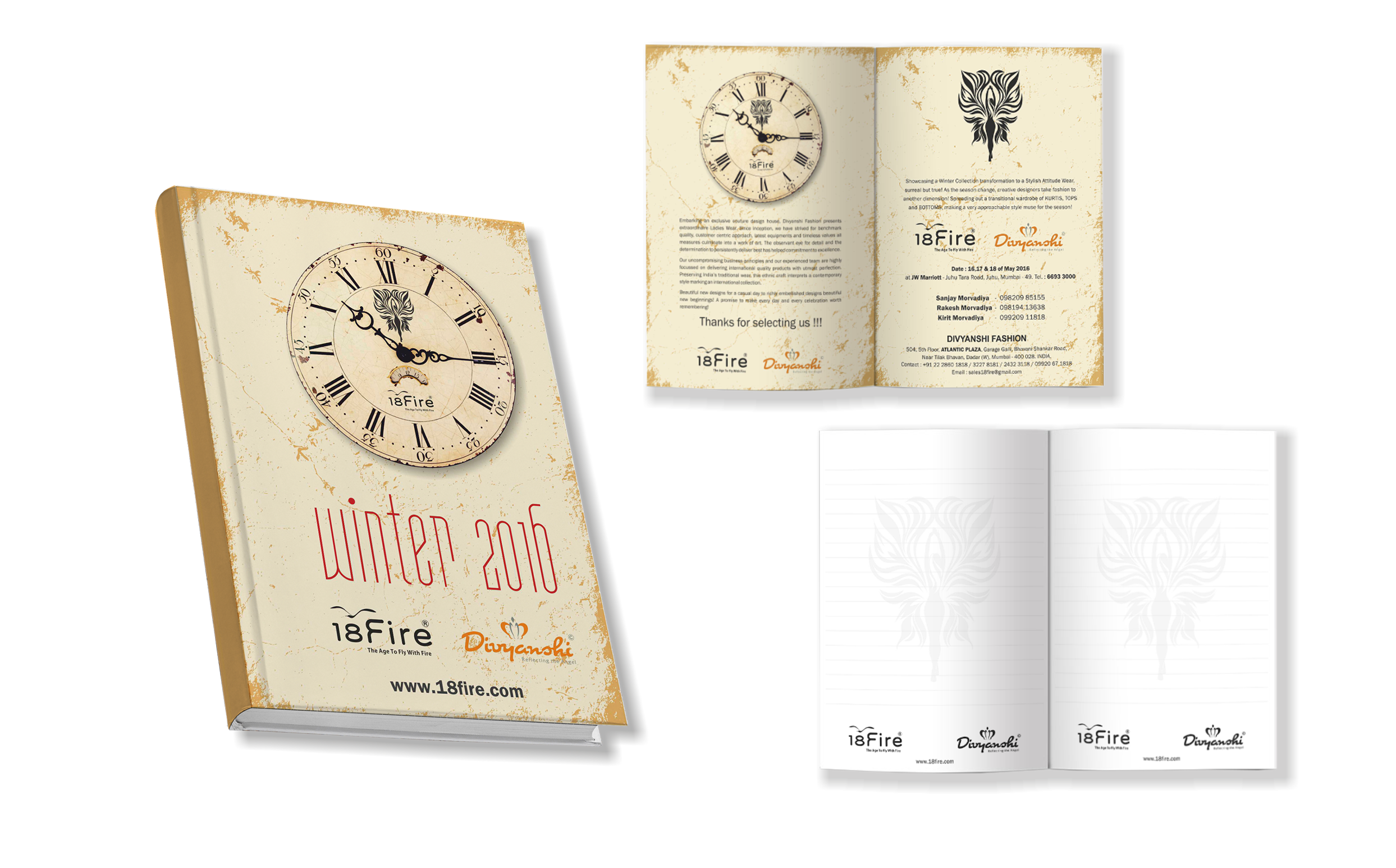
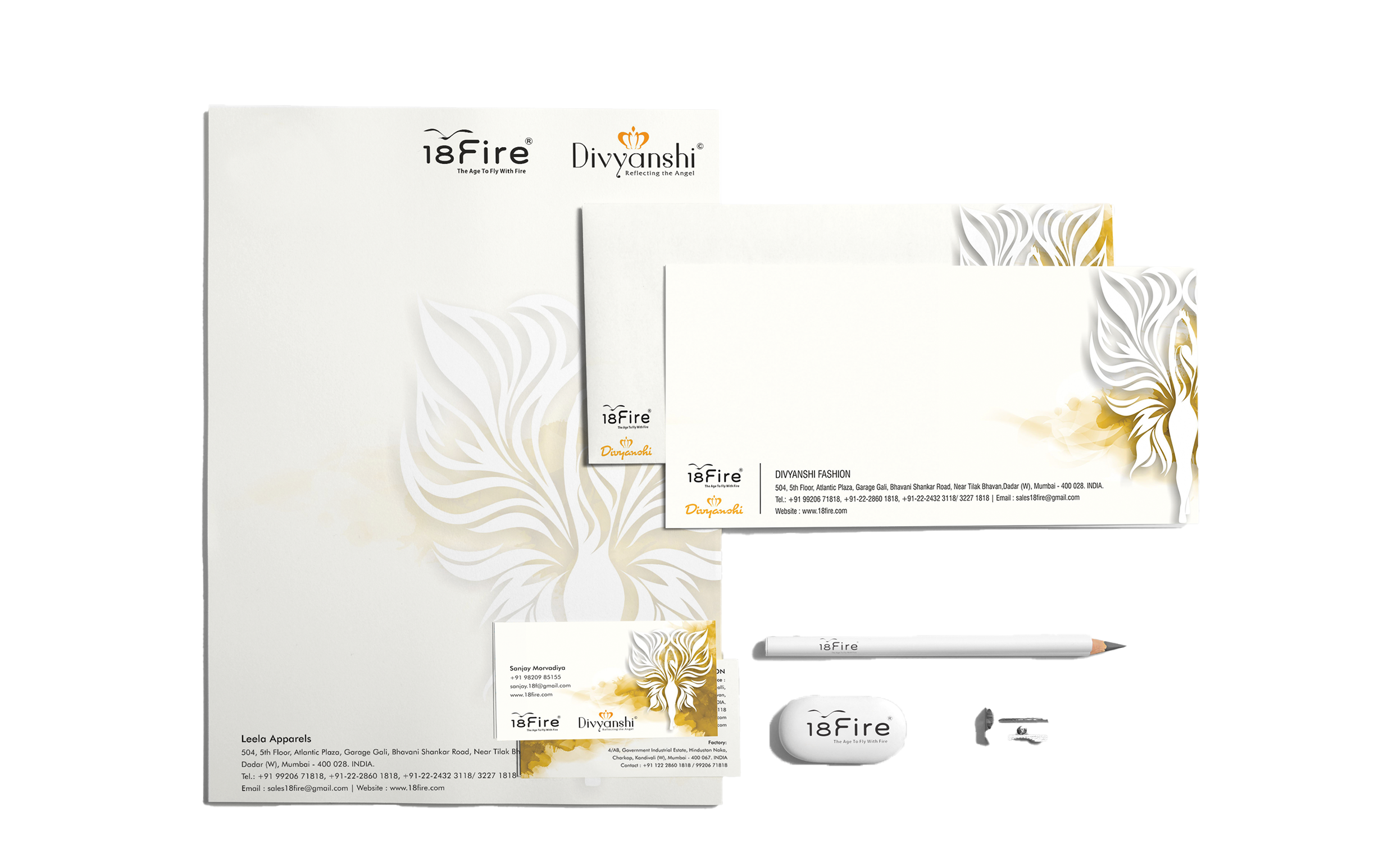
Highlighting the inner thoughts of a girl in the real world – self-esteem and recognition – that’s what our brand identity depicts – freedom – in bright yellow which echoes happiness and positivity. Inspired by the tagline, we designed a girl who spreads her wings gracefully and is full of energy – with a splash of yellow ochre in the background signifying the earthly touch despite the wings of uniqueness.
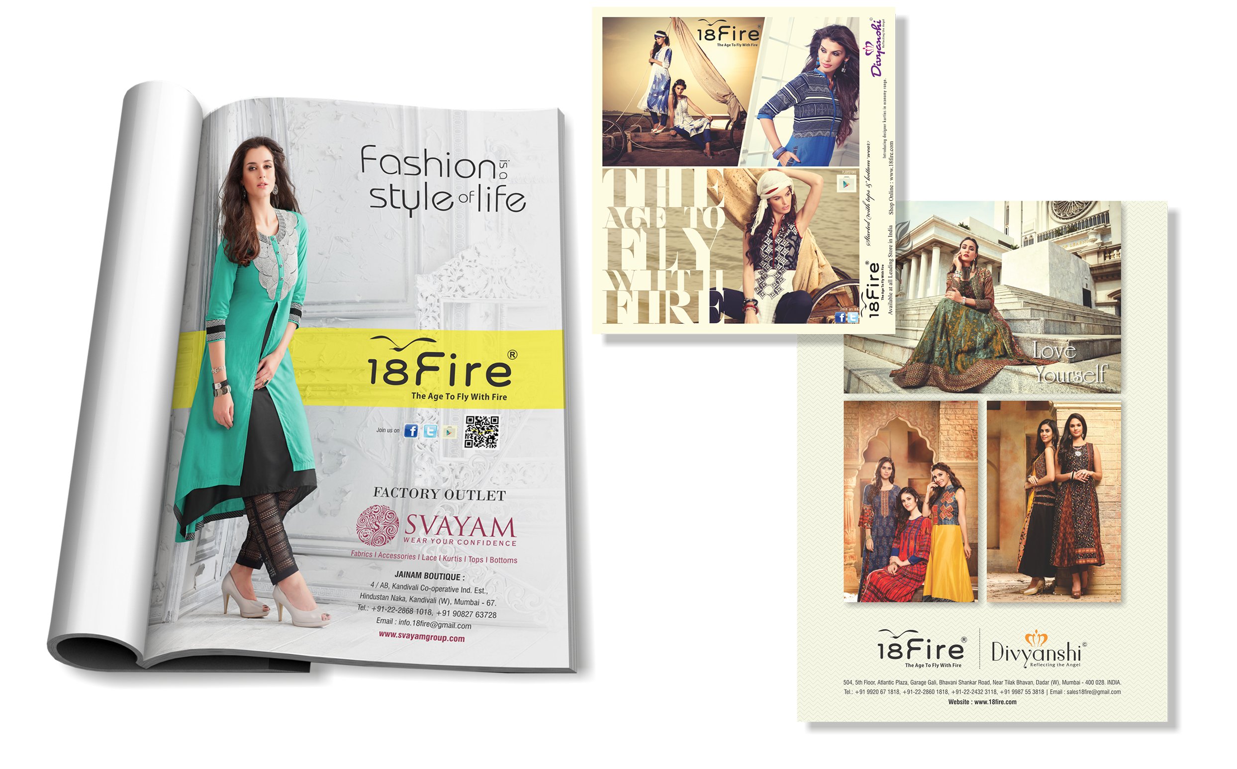
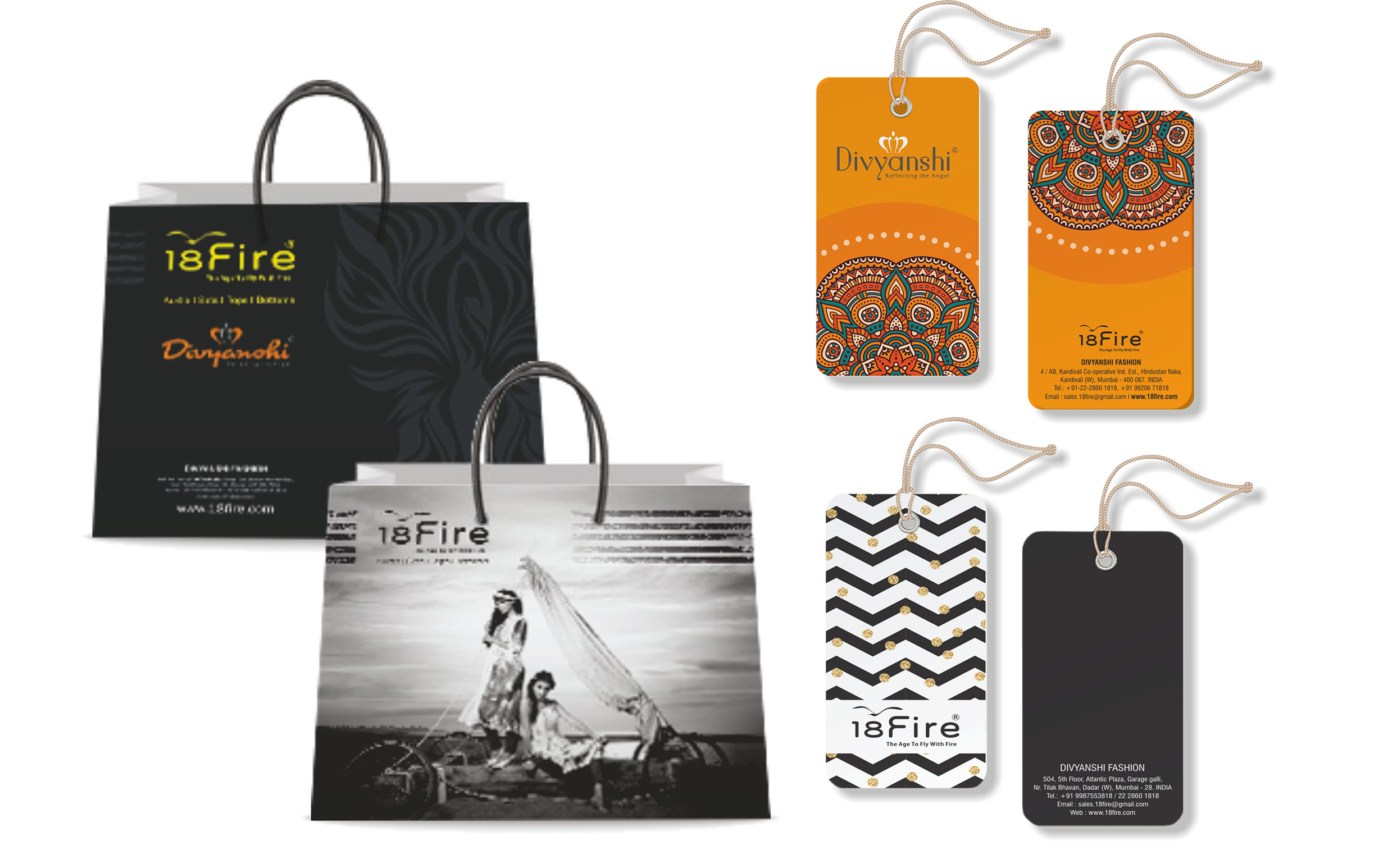
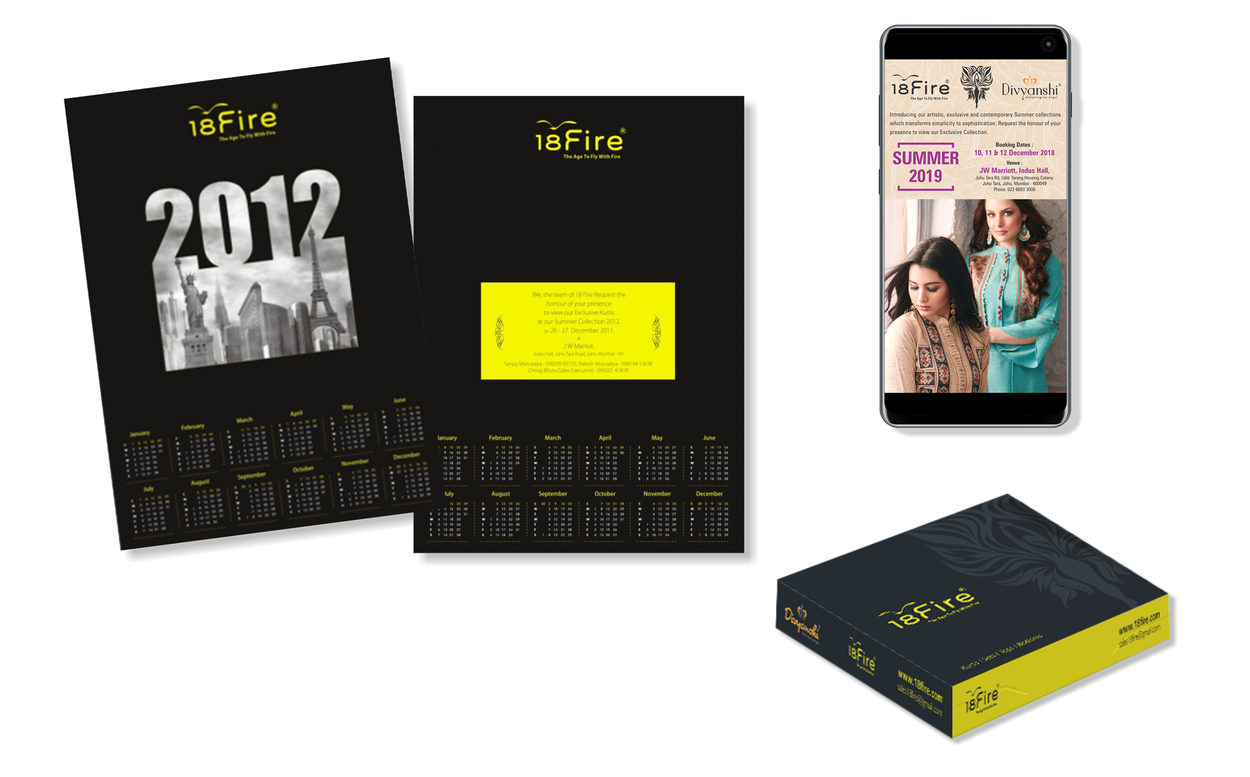
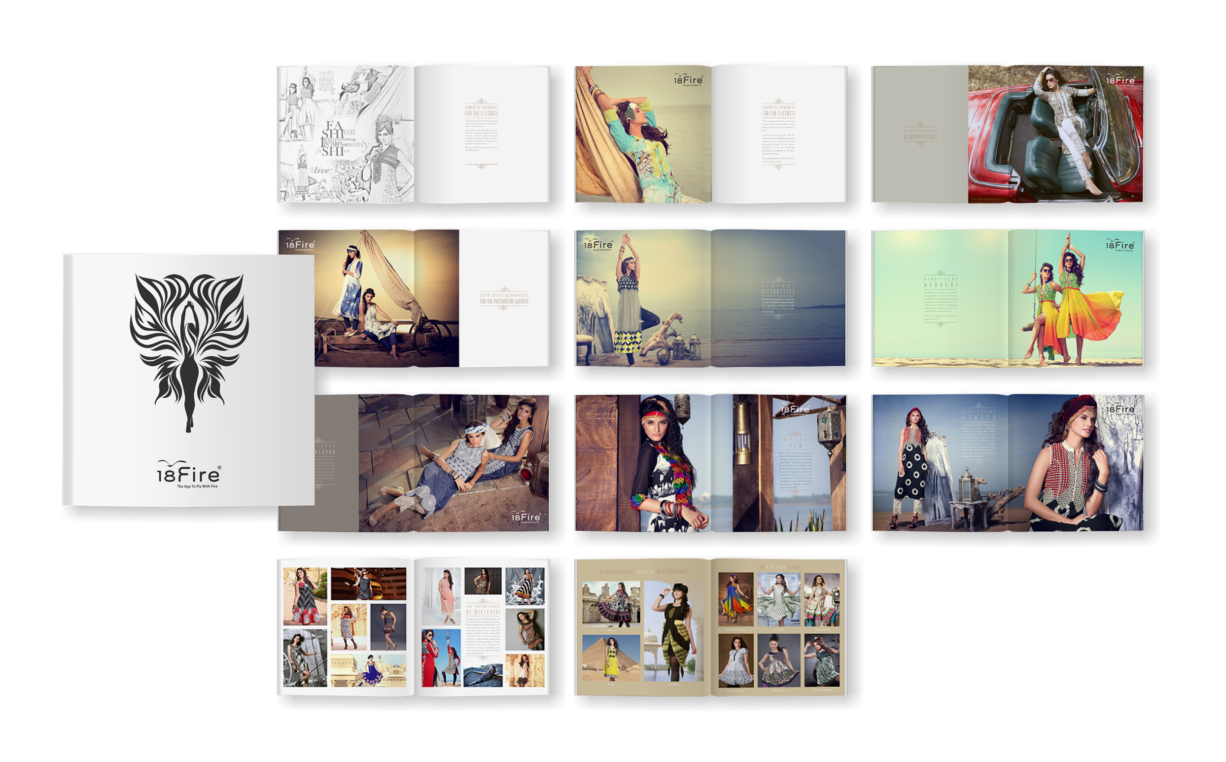
The stationery, diary, shopping bags, tags, invites and many more had the same treatment, whereas the advertisements, catalogue and calendar harped on sophistication.
